The amazing ladies at Studio Sweet Studio were kind enough to lemme do a process post on their site for my OrbitalFleets project. I’ve reblogged it here for redundancy’s sake (and now I don’t have to think of what to post here about it)—but please check out all their doing with SSS if you have a sec. Or even read the post there as it was intended.
via Studio Sweet Studio:


Our friend Nate Utesch walks us through his very thorough process for his most recent project “Orbital Fleets.”
At the retirement of NASA’s US Space Shuttle program, OrbitalFleets is a 30th anniversary poster series. Throughout the course of the year, a large, 2-color, silkscreened poster and a small, full-color, art print will be developed for each of the five orbital vehicles of the United States Space Transportation System.
 Creating the CREW SERIES.
Phase one: References images! First thing I did was create an archive of images, labeling body parts, hoses, reflections…anything that stood out and I knew I’d wanna mimic in the drawings.
My weapon of choice lately is layers of paper on a lightbox with a bottle of India ink at the ready. Even though I’m just using black ink, I’ll pull one page on top of another and sketch out what will eventually be ink separations in photoshop. Loosely vomiting ink on the paper is the name of the game. Failing miserably at the line between a complete mess and some semblance of an astronaut.

The three layers of ink that make up “Crew Series No.2″ and the “Challenger” astronaut.
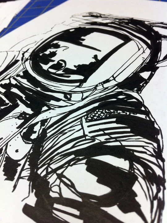
Finished “top layer” for the “Columbia” astronaut.
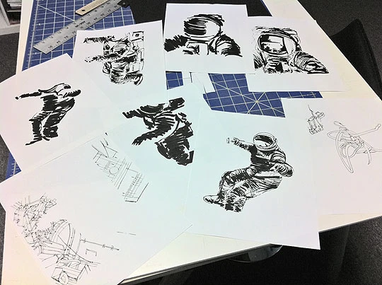
The ones that made it out alive.
There’s no real magic to be had. My only secret weapon in the whole process is the method of creating a transparent ink layer in photoshop. Maybe it’s no secret but since I started doing it, it’s changed my life. Scan at a higher resolution than I need, greyscale it, level out my whites, convert to bitmap at 1200dpi, convert right back to greyscale—retaining the 1200dpi image and all those fun 90º bitmap edges—magic wand the white right outta there, resample back down to my end resolution and bam… pure ink. No paper. Ready for any color. No layer effects.
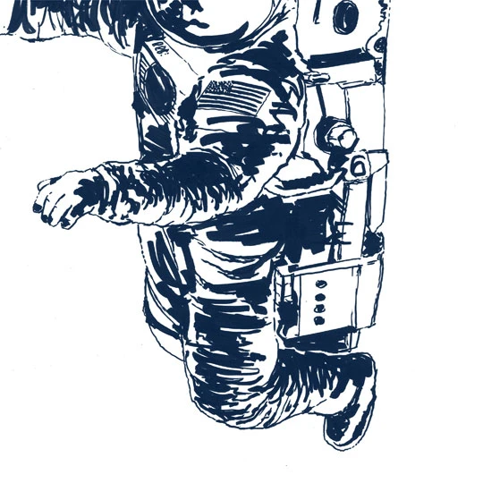 Then it’s time to put ‘er back together. The time intensive part is the addition of textures, distress and rough edges.
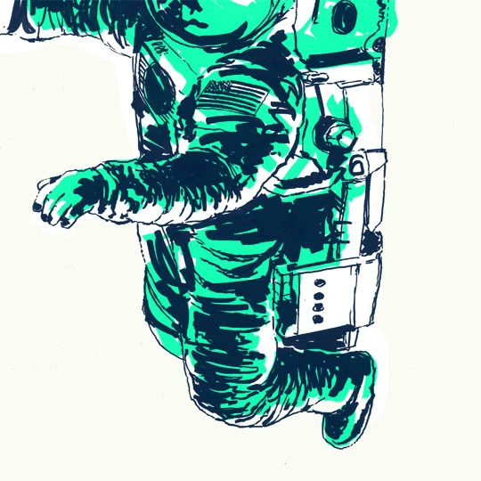
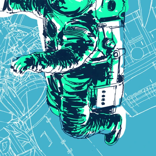
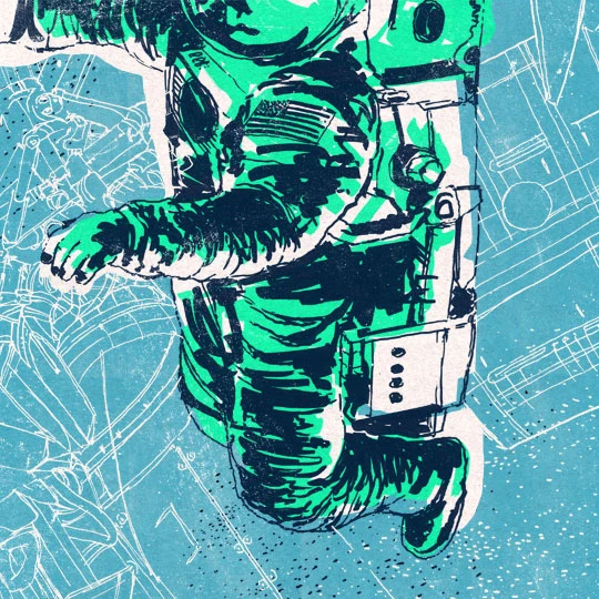
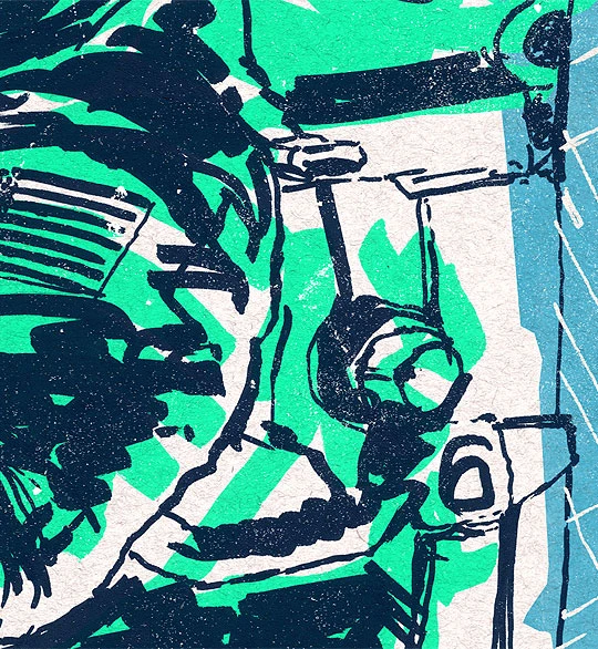
Some of the texture in the “Crew Series No.2″ image.
ORBITALFLEETS.
These posters are the star of the show in the whole project. The “Crew Series” images make a nice little companion to this larger poster series. I thought I’d leave this post with some highlights from the OrbitalFleets project thus far.
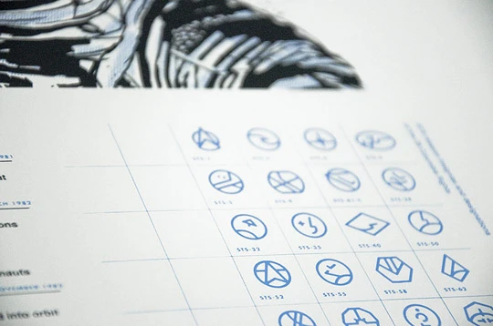
In all, I think there are 133 missions that our shuttle program has launched. I’m creating simplified icons as an alternative to the current mission insignias for each launch. My mind goes numb and it feels like heaven. Or maybe my mind goes numb and I get migraines.
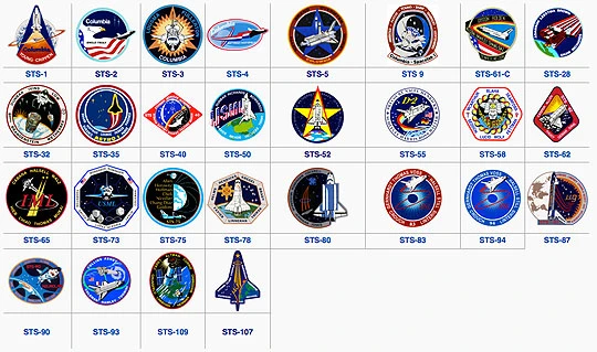 An example of the 28 mission insignias from the Columbia shuttle.
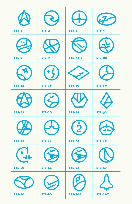 My dumbed down versions.
 I thought I’d also share my favorite icon so far. It’s for Challenger’s STS-41-G mission. Launched October 5, 1984 and was the first mission to carry two women and carried the first Canadian into space.
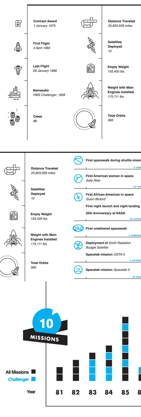 Some of the data shared on the “Challenger” poster.
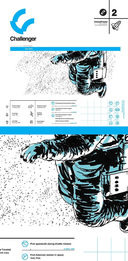 A couple views of the “Challenger” poster all set for print. Notice the “background ink” layer from the “Crew Series No.2″ edition became a half tone pattern for the poster. That’s all. Just notice it. Did you notice it? Ok cool, moving on…
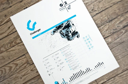 Here’s some photography of the finished pieces. Silkscreened “OrbitalFleets” editions were printed by my good friend Shaun Malinowski of Good Stuff Design Co. and the small “Crew Series” editions are from the wonderful lads at Society6. More views of all the prints can be seen at the official OrbitalFleets webby.
