Every month this summer, that beat is getting louder.
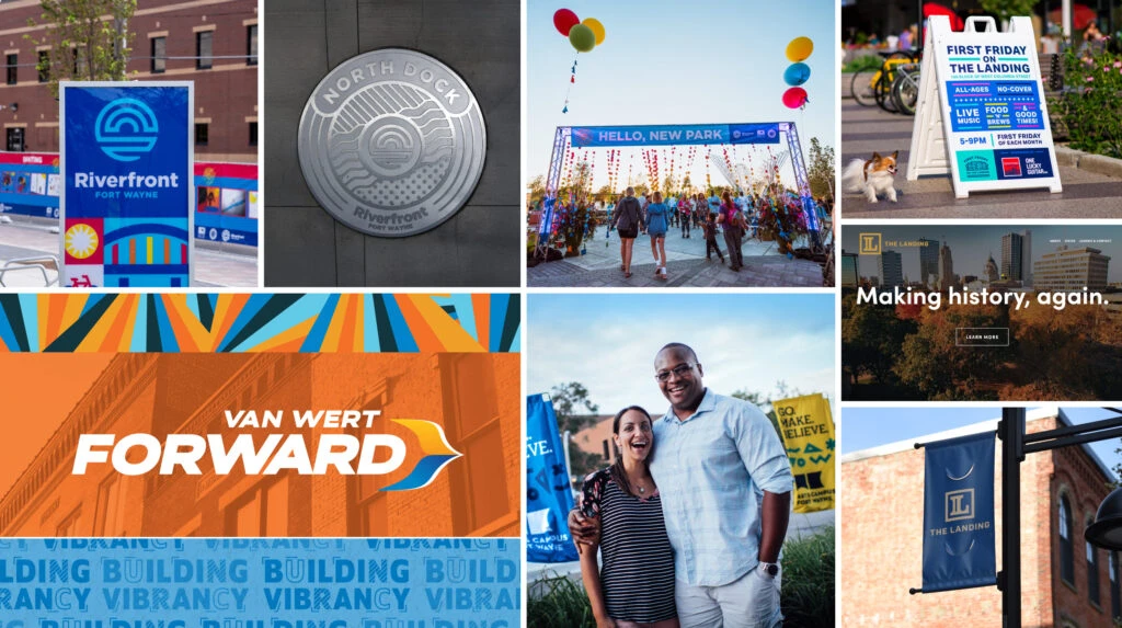
On July 7th, OLG was honored to be part of Riverworks Design Group’s unveiling of schematic design and branding for Riverfront Fort Wayne’s Phase I developments. The presentation was met with great fanfare, and the video we played to unveil the logo had 17K views and 250+ Facebook shares over the next 36 hours.

Earlier this year, Riverworks Design Group was selected to help shape Fort Wayne’s riverfront. Riverworks Design Group is a collective that includes Design Collaborative, Hoch Associates, Engineering Resources, FORUM, American Structurepoint, Lynchpin Creative and One Lucky Guitar.
OLG’s role in RDG is brand development.
From the beginning, we knew that the rivers offered the opportunity to tell a powerful story—one that would be strong, welcoming and distinctly ours. One that would unify. It needed to speak to people of different backgrounds and beliefs, and at the same time, encompass what brings us together at the banks.
Since the Riverfront project is still evolving, the brand also needed to be extendable, aspiring to—and achieving—greatness. It had to speak to where we started, and it needed the capacity to grow with us indefinitely after Phase I.
So we started with soul—the core, unchanging ideology of what our riverfront development is about.
In March, OLG convened a team of brand champions—a diverse group of community leaders to help inform and guide the brand development process.
As people of different ages, backgrounds and beliefs met to share their perspectives on the project, it helped us see the rivers as a whole and reach a unified solution.
Our rivers are alive. They have a rich history that began before our city existed and a future that extends long after us. While some of us grew up with the rivers, others are coming for the first time to find they’re just as busy moving and changing as we are.
We crafted the rallying cry “Always Moving” to convey the rivers’ same, ever-changing nature. Our rivers don’t stop for anything. Just like our region, they’re on the move. Rich with history, yet nimble enough to flow with new ideas.

In the process of defining our rivers, we threw a few kayaks in the water ourselves to experience them firsthand, and we produced a video to give our region a glimpse of all that is to come, and to celebrate all that is already happening.
We then created an identity suite to tie all of Riverfront Fort Wayne’s branding together. We chose a range of bright colors to accommodate the river’s many vibrant, versatile uses, and the logo we created encompasses everything riverfront development is about.
Its continuous line symbolizes the rivers’ inclusive, ongoing nature, and if you look between the lines, you can see three rivers beneath a rising sun.
This is the dawn of a new chapter for our region, where our history meets our future with a promise.