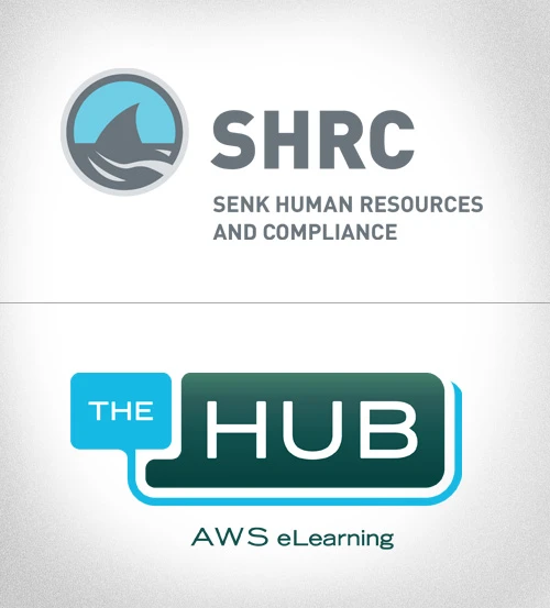
 Here’s two logos that have recently made their way through the office.
The first, for Senk Human Resources and Compliance (SHRC), is a take on the phonetics of the acronym that sounds like the client’s favorite aquatic predator. The goal was to do a shark icon but still convey the seriousness of the business. When doing logos like this, I like to keep the shapes simple and bold so in the case that they’re embroidered on a shirt, they keep their integrity. The first application of the logo was on business cards.
The HUB logo references the internal system of communication for our client AWS. It houses everything from HR to training. They wanted the art to speak to this network and still work with the AWS logo itself.

