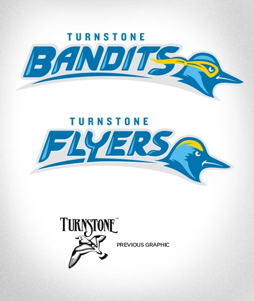
 When we became the team to rebrand Turnstone, an organization that promotes healthy living among people with disabilities, part of the challenge was to refresh their athletic logos. The Flyers (youth) and Bandits (adult) are well-known for their high level of competitiveness around the country. We wanted the teams to have an energetic logo that they could rally behind and show the strength of the support they receive.
Often, with sports logos you know you’ll be manipulating type to develop custom look that is unique to the mark itself. I started by sketching out the Flyer type in a vertical orientation so it’s easier to vectorize later on. Once I have it in Adobe Illustrator, careful consideration needs to be given to the weight of each letter and how they relate to one another. I knew the colors would be the same Pantones as the corporate logo so I didn’t need to worry about making decisions on that.
Next came the bird icon itself. It’s always good to see what exists in the world of college and pro sports to make sure your creation can compete with other teams. Unbeknownst to some (including myself originally), a turnstone is a type of small bird that scours the beach using its specialized beak to hunt. Unfortunately it’s not a very daunting animal so I had to take its cues (shape of beak, areas of coloring) and translate it to a more menacing character. The obvious difference between the Flyers and The Bandits is the addition of the mask which required slight modifications of the spacing and linework around the face.
In the end, Turnstone embraced these logos and I hope to be seeing them appear on all sorts of materials (hats!?) in the future.

