Over the past few months, we’ve developed a few new publications for our friends at AWS/Benchmark — companies that help children and adults with disabilities live as independently as possible, be included in the community and reach their maximum potential. While based here in Fort Wayne, they work with state and local governments across the country, employing more than 3,000 people and caring for the needs of more than 8,500 people (click here for an impressive list of their current locations).
Their growth is a testament to the good work they do. In many locations, they are helping budget-strapped, understaffed State governments care for the critical needs of people with special needs. And thanks to AWS/Benchmark, thousands of people with disabilities are able to play an active role in their community, sometimes even holding jobs and making a living rather than being confined to an institution.
Prior to our involvement with AWS in 2009, their logo and visual branding had already been established. And in 2010, we began working with Benchmark mid-way through a logo redesign. AWS has a huge back catalog of printed publications and now we’re designing new pieces that must relate to these old brochures while introducing touches of Benchmark’s branding.
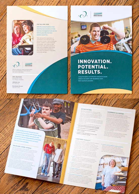
Melding the two distinct brands, disparately developed, has been a rewarding challenge. Starting with the deep teal of AWS and the bright cyan hughes of Benchmark, we expanded the palette by adding warm neutral tones and subtle pops of yellow for balance.
Seen here is the flagship brochure for AWS/Benchmark — a simple, clean 11×17 bi-fold. It’s printed on a smooth, uncoated white sheet for a very nice tactile feel — no glossy corporate booklet here. The piece balances the results-oriented business backbone of AWS with the the warm, appealing results that come from tenderly caring for the needs of those with disabilities.
Additionally, we developed bookmarks and stickers introducing the partnership of the two corporations. These items were inserted into legacy publications that are still being used.
 No Place Like Home
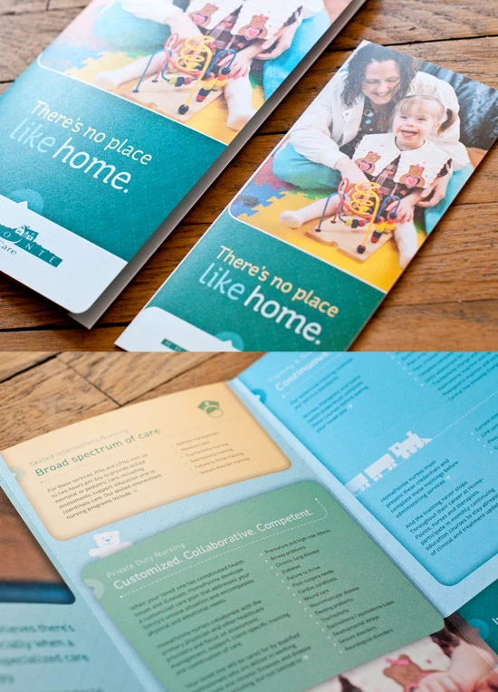
Another project that recently came off the presses was a new brochure for HomePointe Healthcare service, a service line developed by AWS. Homepointe specializes in home-based healthcare for children with chronic health issues and severe disabilities. Most potential clients will be introduced to Homepointe by means of their physician. Physicians receive a slough of literature from similar companies in the same market to pass on to consumers. The brochure is the first and, possibly, the only point of contact Homepointe may have with potential customers, so it better be good.
To help HomePointe stand apart from the competition, we used a high quality metallic paper, oversized dimensions, and rounded off the corners. The warm, candid photo style conveys the compassionate care HomePointe nurses provide. The finished piece has the quality feel you’d expect from AWS, with an added touch of softness and texture that will catch the attention of concerned parents and caregivers.
You may notice there is a smaller tri-fold counterpart in the images. These brochures may be placed in a standard brochure rack in healthcare facilities across the region, so we created the smaller tri-fold to fit in any sized container. It also can be economically mailed in a standard #10 envelope.
We love working with AWS/Benchmark. These noble organizations do a lot of good, and we’re proud to have them based here in Fort Wayne and making a difference across the country.


