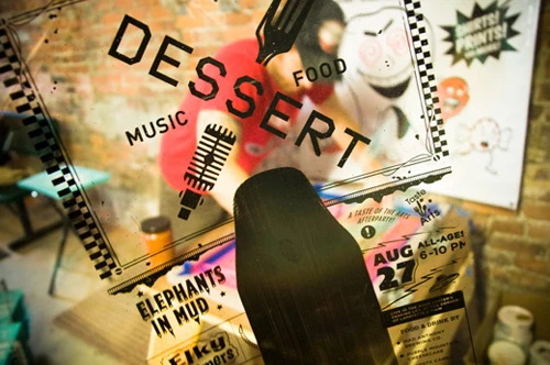
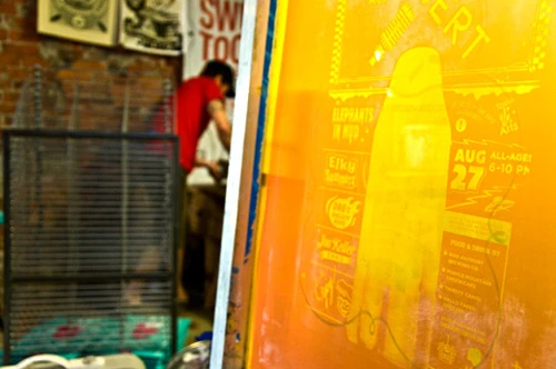
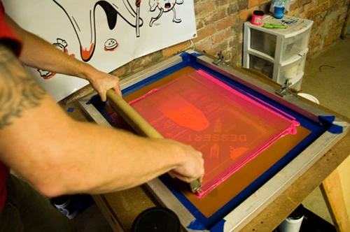
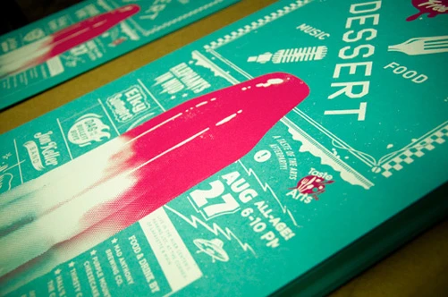
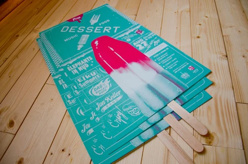
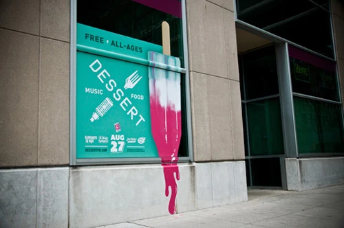
 Recently, we unveiled the new promotional art for this year’s DESSERT, the Official Taste of the Arts Afterparty. Each year I’ve got to develop a look that’s fresh for the event but one that hopefully relates to years past with colors and vibe. This time I wanted to pull from the bright blue and pink palette used last year, but take the style in a different direction relating to a 50’s/60’s vibe of vending graphics. Once I determined to use the visual of a tri-colored popsicle, I knew that I wanted the posters to be silk-screened. I kept the art to 2-colors and I had our friend, Shaun, at Good Stuff Design do the intricate task of printing them. The pictures here show the process at the shop. In the end, we attached popsicle sticks to give the posters added attention.
Also, if you receive our newsletter, or frequent downtown Fort Wayne, you’ve probably noticed the graphic we developed at the corner of Calhoun and Wayne. I’m quite proud of how that turned out with the melting popsicle oozing out onto the street.

