It’s a big day in Fort Wayne. Earlier this afternoon at Parkview Field, there was an event to celebrate the official kickoff of The Harrison, the long-gestating, oft-maligned mixed-use retail and residential component of Harrison Square.
A few of us went down to have a slice of cake, and maybe see if we couldn’t find some closure to a long, long story.
The cake was pretty good.
We thought we’d commemorate this special day by riding our bikes down memory lane. You see, back in the halcyon days of summer ’08, we used to stroll over to the Harrison Square site every couple of weeks, cheering on excavation, applauding raised beams, and celebrating each milestone. Grounds-breaking. Ribbons-cutting. Toppings-off. Rights-named! Once there was concrete, we walked the stadium on a cold afternoon and picked our lil’ four-top field box out in left-field—”Bartman seats” for you MLB fans, and “The OLG Slumdog Suite” for you Cinema Center types. We loved the whole of Harrison Square—we couldn’t wait for the ball team to come downtown, and as a company of people who work, play, and sometimes even live downtown, the mixed-use component of the project was especially appealing.
It’s a long story, but we did a bit of work for The Harrison, back when it was still a condo project, and the powers-that-be liked the early drafts of that work so much that they asked us to take a swing at the ball club’s logo. (You may remember the Legacy-esque process wherein our community was invited to submit name ideas for the former Wizards—as I recall, around a thousand names came in, and the owners had narrowed that to just a handful.)
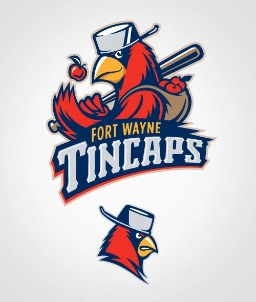 “Tincaps” was a finalist, and we were asked to have a look at what that name might look like if it played out. We felt like we could figure it out, and rather easily—after all, a couple of folks in the OLG family had submitted that very name for consideration.
Our first draft of the logo featured a cardinal—the state bird, after all—with a uniquely “Johnny Appleseed” sense of style and gear. I didn’t work on the illustration myself, so I’m able to throw humility under the bleachers when I call the work sensational.
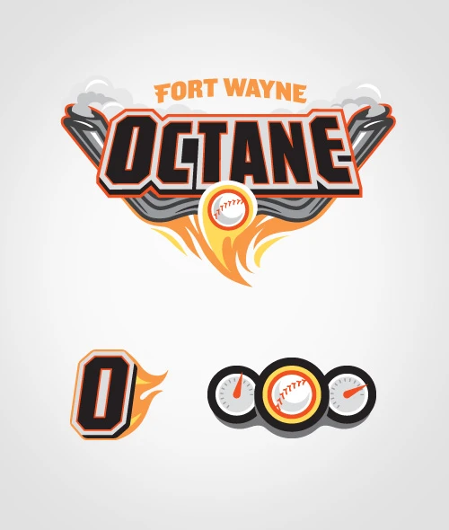 Ultimately, decision-makers felt there were too many birds in baseball, and we were asked to have a go at one of the other final names: Octane, a nod to Fort Wayne’s place in history as the city where the gasoline pump was invented. We had fun cranking up the horsepower on this one.
At this point, it became clear that a firm in Atlanta was also working on a Tincaps’ identity, and we were given a peek at the draft of a “cartoon” apple, wearing a tin cap, and with some giant, chunky, steel letters spelling out the team’s name. We’ve all gotten used to the logo by this point, but at the time, I’ll be honest and let you know we were absolutely aghast. (We were either design snobs, or simply passionate about this team and our community.) (Probably both.) (Still are.)
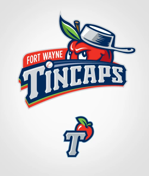
We were given one last chance—OK, if it had to be an apple, what would our interpretation be? We rolled up our sleeves, pulled tight our batting gloves, adjusted our cups and put our hearts into one last spirited, rally-cap wearing attempt.
Unfortunately, Atlanta won the battle. I suppose the war is TBD.
Sincerely,
Matt Kelley

