The Dial
Posts categorized as Art & Strategy, Too
-
 READ MORE
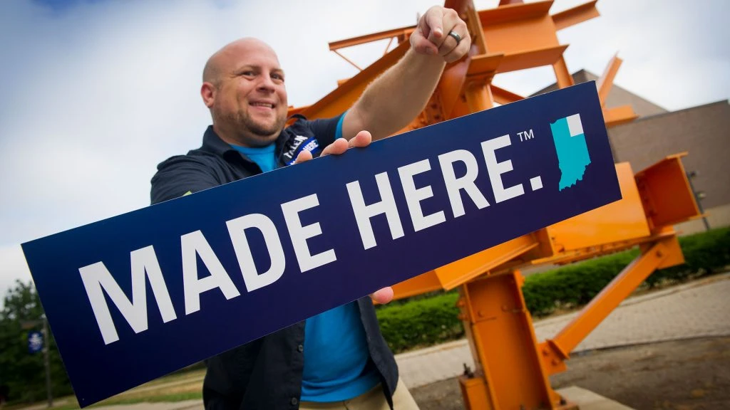
Note: This blog post is no longer being updated or maintained. We cannot guarantee accuracy or accessibility. This summer, we were given the opportunity to design and build the new Turnstone website, and we were more than excited. OLG had [...]
-
 READ MORE
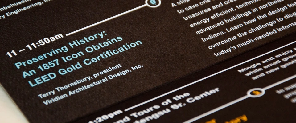
Note: This blog post is no longer being updated or maintained. We cannot guarantee accuracy or accessibility. The team at OLG has known renaissance man Wayne Shive for years. We’ve done work for many of his business endeavors, which include [...]
-
 READ MORE
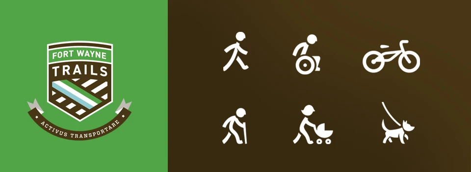
Note: This blog post is no longer being updated or maintained. We cannot guarantee accuracy or accessibility. At One Lucky Guitar, we live on the city’s bike lanes, bike routes and trails. Many of us bike to work (or at [...]
-
 READ MORE
Note: This blog post is no longer being updated or maintained. We cannot guarantee accuracy or accessibility. Now that schools in the area are back in full swing, it’s nice to think that some of them will be identified with [...]
-
 READ MORE
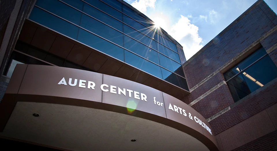
Note: This blog post is no longer being updated or maintained. We cannot guarantee accuracy or accessibility. Last week, Arts United’s Auer Center for Arts & Culture (formerly the Fourthwave Building) had the building name installed on its front awning. [...]
-
 READ MORE
Note: This blog post is no longer being updated or maintained. We cannot guarantee accuracy or accessibility. When we became the team to rebrand Turnstone, an organization that promotes healthy living among people with disabilities, part of the challenge was [...]
-
 READ MORE
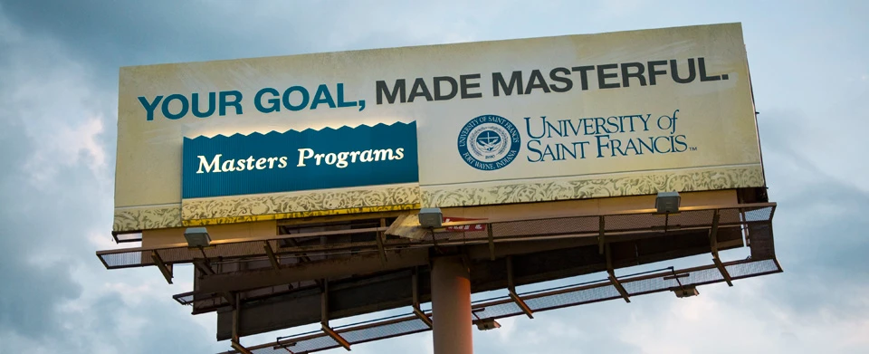
Note: This blog post is no longer being updated or maintained. We cannot guarantee accuracy or accessibility. I just got some visuals of a billboard we created a few months ago for The University of Saint Francis. Previously, this particular [...]
-
 READ MORE
Note: This blog post is no longer being updated or maintained. We cannot guarantee accuracy or accessibility. Indiana Tech holds a special place in my heart. This small but mighty university was my employer prior to One Lucky Guitar. When [...]
-
 READ MORE
Note: This blog post is no longer being updated or maintained. We cannot guarantee accuracy or accessibility. So there’s a great university out East and fortunately we get to do work with’em. The George Washington University, in Washington D.C., is [...]