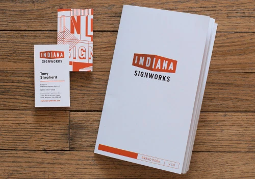
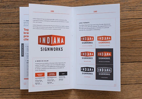
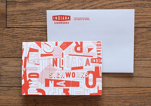
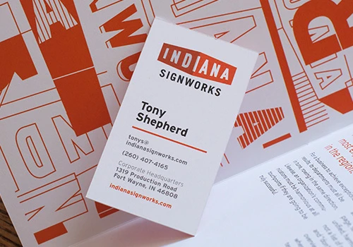
 One of OLG’s recent projects was creating the initial branding for Indiana Signworks—the new organization that brings together Indiana Stamp’s sign division and Mid-America Sign to form one of the largest, most experienced full-service sign companies in the region. We developed a logo, business suite, brand book and interim website to get things moving.
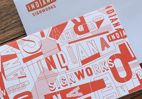
The logo was designed to be a very strong mark representative of the work Indiana Signworks does on a daily basis—making signage that communicates clearly. The two-tone shadowed shape hints at large, outdoor building signage. The color comes from the orange of their parent company and relates to other ventures of the business. In addition to the logo, we made an abstract repeating pattern made from the structure of the mark and construction blueprints for 3-D signage. This art element helps give extra vibrancy to brand elements and will hopefully become a recognizable texture to future pieces; it shows up on the back of the business cards, a strip on the letterhead, a flood on the brand book and the front of an A6 folded notecard.
We see this work as the start of a long-running, respected business and we’re glad we are a part of it!


