
 What started with a logo refresh last year had turned into quite an overhaul of the visual character of OLG. The first thing tackled was the “business suite” of business cards, letterhead, envelopes and notepads. Some noteworthy spec elements include the clear foil stamp for the back of the business card, the off-white Mohawk stock for the letterhead and the 1-color blue inside the envelope.
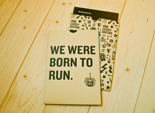
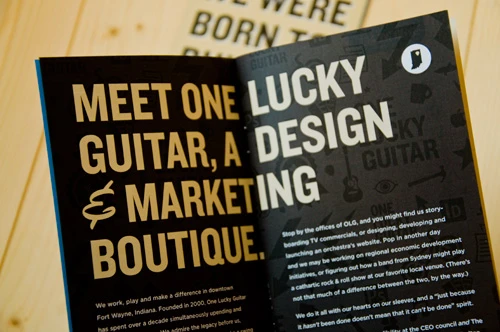
Next on the list was the ability to tell our story to clients, new hires and passers-by. We called this project The Brand Book and it became a 16-page mini brochure, tucked into a branded sleeve. This piece describes where we came from and what we stand for; what’s our mission and what we promise.
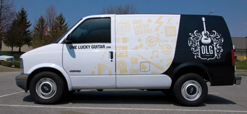
The latest interpretation of the brand—and our most mobile—is the OLG van. We bought an older Coke hauler and spiffed it up with some custom illustration. All the icons represent something in our office. I know you can’t look away from those whitewalls either, ha.

