At One Lucky Guitar, we live on the city’s bike lanes, bike routes and trails. Many of us bike to work (or at least get our wheels out over the weekend for a bit of exercise) and earlier this year we were awarded the designation of ‘Bicycle Friendly Business’ from the League of American Bicyclists. So it was much to our delight when Fort Wayne Trails approached us about designing a new logo. We immediately said yes, and went to work crafting a new identity for an organization that shares our greenway passion.
A Little History
Fort Wayne Trails, Inc. is a newer non-profit entity established at the end of 2010, but its roots stretch back for many years. Actually, our city’s river greenways date back to the 1970s. Over the years, support for these trails was provided by non-political fundraising groups, most notably The Greenway Consortium (GC), Northwest Allen County Trails (NWACT) and Aboite New Trails (ANT). These groups were particularly active in the last ten years. In 2001 there were around 18 miles of trails and greenways. As of October 2011, that number grew to 66 miles of trails! About 50 of those are connected as a single network. You can literally hop on a bike (or run) for 50 miles without having to leave the trails. Impressive.
Even with this awesome network, we’re barely scratching the surface of what’s possible in Allen County. For instance, the immense southeast side of the city has virtually no trails at all. That doesn’t mean no one cares about the southeast, but the fundraising and advocacy groups in the city were focused on specific areas, such as Aboite or NW Allen County. Because of this, these non-profit groups, who all had similar goals, ended up competing for funds. So, at the behest of the mayor, the leaders of ANT, GC and NWACT got together and realized they’d be stronger if they joined forces and served the entire region. Hence, Fort Wayne Trails, Inc. was born. A single non-profit entity that could combine fundraising power and give equal representation to all boroughs of the city, and beyond.
That’s the history in a nutshell. The full story is more complicated, exciting and involves inspiring grass roots fundraising efforts and even Oprah Winfrey. But that’s a story for another time. Whatever the case, the task ahead was clear — a fresh identity was needed to spearhead a new era of trail advocacy and fundraising.
Design Process
The art directors at OLG all took a stab at the logo. While each bringing our own style to the table, we agreed that the logo needed to exude quality. After all, the trail developments in our region are of national significance. We’re becoming an example for how other cities should do it and many are taking notice. (In fact, the MidWest America Trails & Greenways Conference held their 2011 annual convention in Downtown Fort Wayne. That means something, right?) For many, FWT’s branding would be their first introduction to the city. We want that first impression to sparkle with the quality and polish of a modern, progressive city.
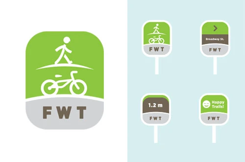
Of course, on a daily basis the logo has to be friendly and approachable to residents right here at home. It needed to feel natural and “parkish.” We also were cognizant of the fact that the brand must work with plans for signage, wayfinding and maps that would be out on the trails. The typography would need to scale; the logo would need to be iconic. It would need to work on a sticker, on a road sign or on a t-shirt.
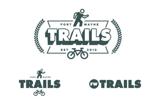
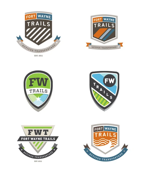
Some of our early concepts that rose to the top included icons because of their universal appeal and understanding to any language group. We also gravitated toward shields and crests to exude a sense of establishment and officiality. You can see many of our concept and drafts to the left, all of which had some element that made their way into the final logo and branding.
The Logo
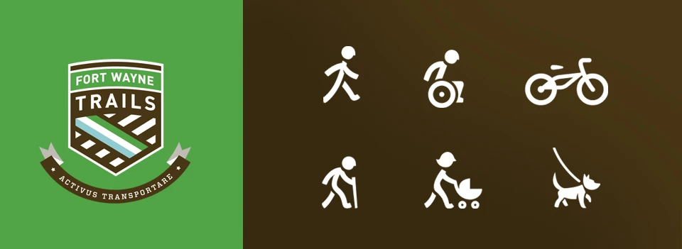
The chosen design was the crest. Former FWT Board Chair Mark Pope remarked: “We arrived at a new identity that we believe captures who we are as an organization, namely, an enterprise with staying power, strength, focus, energy and commitment to connecting population centers throughout the Fort Wayne and Allen County area. We’re thrilled to unveil our new logo and applaud One Lucky Guitar for the creativity, substance, intelligence and cool factor they’ve infused into our brand.”
The shield conveys a sense of history and pride in the accomplishments of the preceding organizations, and it evokes the duty Fort Wayne Trails has to carry on their legacy. The simple lines of the logo represent the 66+ miles of trails that meander though our region’s neighborhoods, farms, urban areas and waterways. The icons you see at the top of the page aren’t part of the logo, but they are intrinsic to the branding. This family of icons communicate the friendly, inclusive nature of the trails to people of all languages, ages and backgrounds without without saying a single word.
To handle the written communication, we looked to the powerful DIN typeface. It’s a signage powerhouse, scaling beautifully for a variety of weights and widths for different situations. And yet, it’s not too technical or harsh, either. It has an educational quality, a softness that gives the letterforms a warm “national parks” feel — you could almost see it as yellow lettering carved out of brown-painted wood down in the Hoosier National Forest. Vitesse is a complementary font that has limited use, but you’ll see it pop up here and there in printed materials.
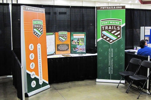 Oh yeah, the motto Activus Transportare (Latin for ‘active transportation’) is a nod to the healthful and environmentally friendly benefits the trails bring to our community by encouraging people to get outside and get active.
In a press conference announcing the new logo, Mayor Tom Henry enthusiastically spoke about what the new Trails identity means for our city: “I hope this logo becomes synonymous with community pride. Our trails add to the aesthetics and offerings of our community.”
Thanks, Mr. Mayor. We hope so, too. We’re proud of the work and proud to represent the region we love. Some really stellar signage has already been installed at the kiosk at Engle Road, which I’ll discuss in a future post, and we’ve already created some banners and other fundraising materials we’ve used at a few trade shows, races and public events. And there’s lots more to come, too, like websites, maps, fundraising collateral and more. Stay tuned.

