Most graphic designers have a type of project they particularly enjoy. Some favor billboards or print ads. Some love logos best. Some favor web design. My fave? Annual reports—one publication full of potential for many different kinds of creative challenges: typography, illustration, photography, charts and infographics.
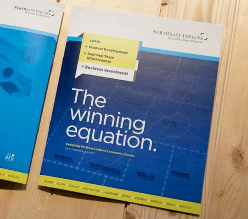
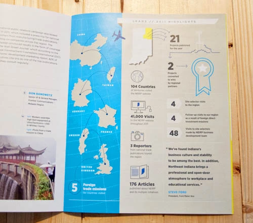
We recently wrapped up The Winning Equation, the 2011 annual report for the Northeast Indiana Regional Partnership—designing this report did not disappoint. The RP had a successful 2011, and they wanted an annual report that really captured the excitement and energy behind the year’s initiatives.
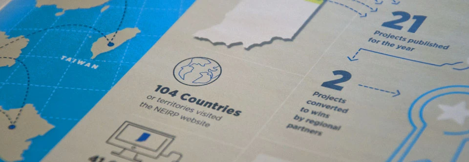
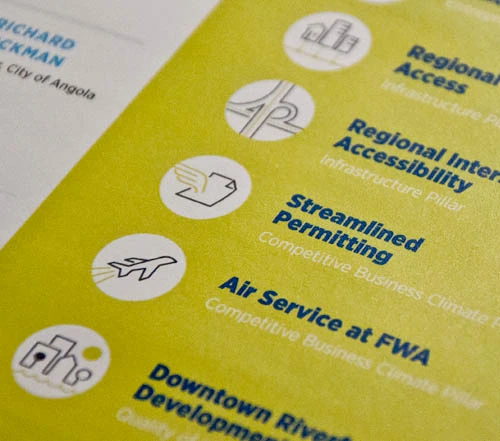
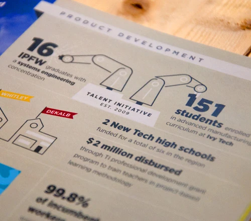
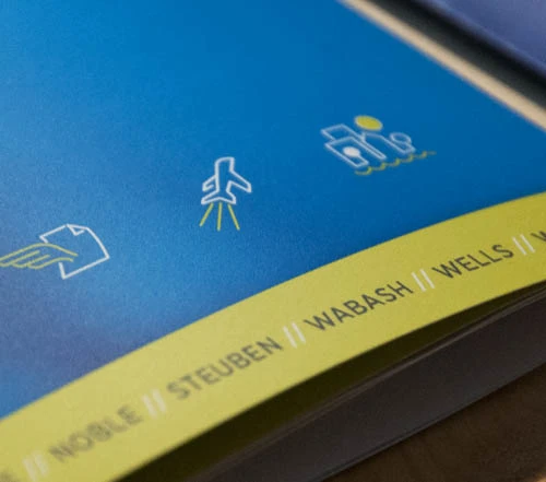
At the core of the content was an equation for regional success: leads + product development + regional team effectiveness = business investment. As mere words, that equation could seem a little dry, but we used illustrations and info graphics to illustrate the different components of this equation throughout the report. Also, a significant portion of the content was devoted to the regional priorities, for which we developed a family of icons.
Here are a few photos of the finished piece. We’re pleased with the outcome, and proud to have the OLG name on it.
You know, thinking about annual reports in general, what I love most about these publications is their ability to set the pace for an organization. Years ago, these kinds of books used to be viewed as a wrap-up for the year—celebrating the good, explaining why the bad happened and how it won’t happen again. That kind of content can get dry and routine. But a well-crafted annual report can be a key component to engage and educate your investors and stakeholders. It’s a chance to reinforce your mission. It builds steam and arms your stakeholders with the knowledge to tell your brand story.
The NEIRP’s goals to help our region prosper economically are noble, and it was a pleasure to help tell their story. We’re looking forward to an exciting 2012 for their team and for all of Northeast Indiana.

