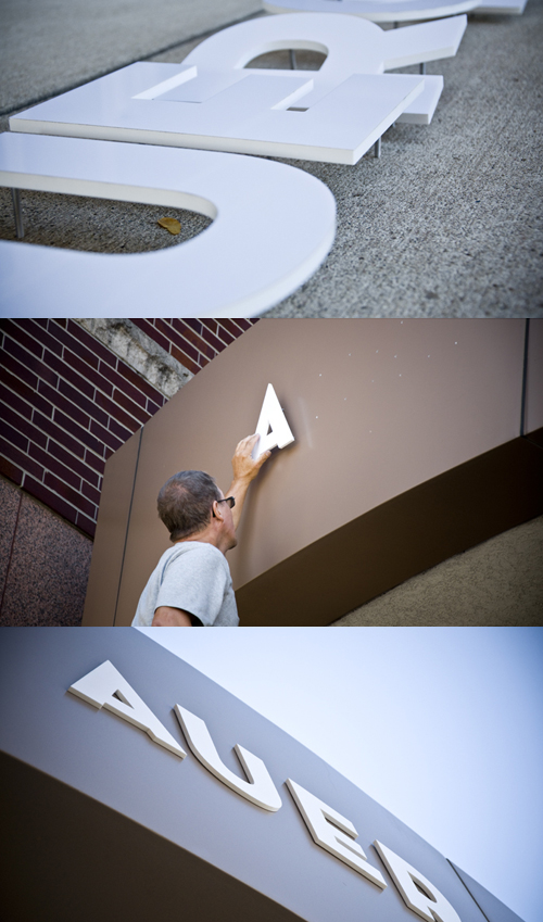
Last week, Arts United’s Auer Center for Arts & Culture (formerly the Fourthwave Building) had the building name installed on its front awning. We typeset these for Arts United in the gorgeous Neutraface Display Titling. Neutraface is a quirky font — sometimes looking a little too art deco for my tastes. Yet, in this bold weight and set in white, it has a playful quality to it that softens the facade of the building and portrays the friendly nature of Arts United’s amazing staff.
Auer Center is home to Arts United’s administration offices, The Fort Wayne Ballet, Artlink, Fort Wayne Trails and Pembroke Bakery & Cafe. With these tenants, the building will attract hundreds of families into the downtown area every week. Needless to say, this corner of the city will see even more activity on a daily basis. So, it makes sense to have the building identified prominently.
While this lettering design and installation is simple, it is also very significant. This is the first installation of many to come for the Arts Campus signage project we’ve been working on with Arts United. As you may know, Auer Center is part of a growing arts campus, which includes FWMoA, The Hall Center (home to Cinema Center), The History Center, Arts United Center and more. The project includes building identification, monument displays and an exptensive wayfinding system that connects all of these structures and their tenants. A project like this is big. Really big. So it’s exciting to see the first element in place after so much research and planning over the past year.
Stay tuned. There’s a lot more to come.


